Theognis Sans Serif: A Practical Font for Modern Web Layouts
I remember the exact moment I knew the header typeface for my latest project was wrong. I had spent an afternoon tweaking a portfolio landing page for a creative consultancy, cycling through system fonts, freebies from design bundles, and a few premium options I had bookmarked. Nothing clicked. The headlines looked either too rigid or too playful, and the visual hierarchy felt flat. I needed something that could carry authority without feeling cold, and sophistication without being fussy. That is when I pulled up Theognis and set it against the hero section. The difference was immediate.
First Impressions in the Hero Section
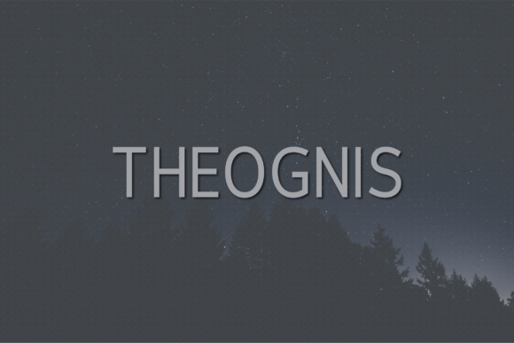
Theognis is a contemporary sans serif typeface with a clean, confident presence. When I dropped it into the hero headline of my test layout, the uppercase characters stood their ground without shouting. The letterforms are well proportioned, with enough character to feel intentional but not so much that they distract from the message. I was testing a headline that read “Strategic Design for Emerging Brands,” and every letter sat comfortably next to its neighbor. The spacing felt even, and the overall rhythm of the text made me want to read on.
What struck me first was the balance between geometry and warmth. Sans serif fonts can sometimes feel sterile, especially in all-caps applications. Theognis avoids that trap. There is a subtle softness in the terminals and a steady uniformity in stroke weight that makes the typeface feel both modern and approachable. For a portfolio homepage where first impressions matter, that tonal balance is gold.
Where Theognis Shines in a Digital Layout
After the initial test, I began placing Theognis across different parts of the layout to see where it performed best. For this particular project — a portfolio redesign for a small branding studio — I found the font worked beautifully in:
- Hero titles and section headings. The uppercase set gives headings a bold, editorial feel. Even in single-line headers, the typeface maintains clarity and impact.
- Call-to-action buttons. Short phrases like “View Work” or “Get in Touch” read clearly at button sizes, and the consistent stroke weight helps the text feel solid inside the button shape.
- Navigation labels. Menu items set in Theognis felt cohesive and deliberate. The clean lines make small text legible without forcing the user to squint.
- Logo or wordmark accents. If you are designing a digital brand kit, Theognis can anchor a wordmark with understated confidence. I tested it as a standalone logotype treatment, and it held up well at both large and small scales.
That said, I did not use Theognis for long body copy. The typeface is better suited for display purposes — headlines, subheadings, short emphasized text, and decorative accents. For paragraph content, I paired it with a neutral sans serif body font that could handle longer reading sessions without fatigue. Theognis works best when it leads the visual hierarchy, not when it carries the full weight of a content-heavy page.
Readability Across Devices and Backgrounds
One of the first things I check when evaluating a font for web use is how it behaves on mobile. A beautiful headline that looks perfect on a 27-inch monitor can collapse into awkward spacing or lost detail on a small screen. I tested Theognis at various viewport widths, and I was pleased with how the letterforms held up. Even at smaller sizes, the uppercase characters remained distinct, and the numerals from 0-9 were easy to differentiate — something that matters if your layout includes pricing, dates, or data points.
I also experimented with dark and light backgrounds. On a light background, Theognis looks crisp and professional. The contrast is clean without feeling stark. On a dark background, the font takes on a more sophisticated personality, especially when used in white or off-white. I placed it over a full-bleed image banner in one test, and the text stayed readable as long as the overlay had sufficient contrast. For image overlays, I recommend adding a subtle gradient or semi-transparent background to keep the type legible, especially on hero sections where the background image may shift.
Button Labels and Small Touchpoints
Buttons are a common pain point for display fonts. Some typefaces that look elegant in a headline turn muddy or cramped when scaled down to 14 or 16 pixels. I tested Theognis in button labels across three sizes, and it performed consistently well. The open apertures and balanced letter spacing helped the text remain clear even at compact sizes. For a boutique online store or a coaching website where CTAs drive conversions, this kind of reliability matters. Users need to read the button text quickly and act on it, and Theognis does not get in the way of that behavior.
Font Pairing for Digital Identity
Finding a good companion for Theognis took a little experimentation. Because the font has a distinct personality, I wanted a body typeface that would support without competing. I ended up pairing it with a clean, neutral sans serif for paragraph text — something with slightly lower contrast and a more neutral tone. That pairing created a clear hierarchy: Theognis for the bold statements, and the body font for the supporting information. If you are working on a course sales page or a landing page for a digital product, this kind of pairing can elevate the overall brand experience without overwhelming the visitor.
For projects where I wanted a more editorial feel, I tested Theognis alongside a classic serif font. The contrast between the modern sans serif headlines and the traditional serif body copy created a layered, sophisticated tone that worked well for blog headers and campaign landing pages. The key with any pairing is to give Theognis room to lead. It does not need much competition to make an impact.
Practical Considerations Before Going Live
Before committing Theognis to a live website, there are a few technical checks that every designer should run. First, confirm that the font files are available in webfont formats — typically WOFF and WOFF2 — so the typeface loads efficiently across browsers. I also checked for available weights and styles. Theognis offers enough versatility for most digital projects, but I always recommend verifying that the specific weights you need for headings, buttons, and accents are included in the package.
Alternates and special characters are another consideration. If your project includes multilingual content, you will want to confirm that the typeface supports the character sets you need. Punctuation and symbols are included in Theognis, but do not assume coverage for every language variant. A quick glyph check before development saves time later.
Licensing is something I never skip. Theognis is a commercial font, and using it on client websites, online stores, or digital templates requires the appropriate license. Whether you are building a brand kit for a small business or a full e-commerce site, make sure your license covers web use. This protects both you and your client from legal headaches down the line.
Real Project Fit: Where Theognis Belongs
After working with Theognis across several test layouts, I have a clear picture of where it fits best. It is an excellent choice for:
- Portfolio websites where the designer or creative wants to project a polished, confident brand.
- Boutique online stores where product headings and category titles need to feel curated and premium.
- Coaching or consulting websites where trust and clarity are essential in headers and call-to-action areas.
- Digital brand kits that require a consistent, recognizable typeface across web and social media graphics.
- Campaign landing pages where a strong headline can make or break the visitor’s first impression.
I would hesitate to use Theognis as the sole typeface on a content-heavy site where users need to read long articles or dense product descriptions. It is a display font at heart, and treating it as a workhorse for extended body text will dilute its impact. Save it for the moments that matter most in your layout, and let it do what it does best: command attention with quiet authority.
Building a Consistent Brand Experience
Typography is one of the most visible signals of brand quality on the web. A well-chosen typeface can make a site feel more trustworthy, more polished, and more memorable. Theognis helped me achieve that in my portfolio project without forcing me to overcompensate with other design elements. The headlines felt right, the buttons felt solid, and the overall visual hierarchy guided the user naturally from one section to the next.
If you are a web designer or digital creator looking for a sans serif that balances modern clarity with a touch of personality, Theognis is worth testing in your next layout. Put it in a hero section, check it on mobile, pair it with a complementary body font, and see how it shapes the tone of your project. In my experience, it turned a good layout into one that felt more intentional, more polished, and more aligned with the brand story I was trying to tell.